
Portfolio widget
The Portfolio widget allows you to display and showcase your portfolio items in a structured, visual, and engaging way. It is designed to present collections of work, projects, case studies, visuals, or examples in a clean layout that visitors can easily browse.
Before you can use the Portfolio widget, you must first create a portfolio and add portfolio items. This article focuses specifically on how to use the Portfolio widget to display those items on your pages. A separate article covers how to create and manage portfolios and portfolio items.
What Is a Portfolio and When Should You Use It?
A portfolio is a curated collection of visual or content-based items that represent work, results, or examples. Portfolios are commonly used to:
- Showcase creative work (design, photography, illustration, video)
- Present projects or case studies
- Highlight client work or references
- Display product concepts or prototypes
- Share visual inspiration or collections
Using a portfolio is beneficial because it:
- Makes complex work easier to browse
- Adds visual credibility and professionalism
- Helps visitors quickly understand what you do
- Encourages exploration without overwhelming the page
Typical use cases include:
- Agency or freelancer websites
- Creative portfolios
- Case study sections
- Product or concept galleries
- Inspiration or reference libraries
Prerequisite: Create Portfolio Items First
Before adding the Portfolio widget, make sure that:
- A portfolio has been created
- One or more portfolio items exist inside that portfolio
The Portfolio widget does not create content on its own—it only displays existing portfolio items.
Adding the Portfolio Widget
- Drag the Portfolio widget onto your page.
- Click Edit Items.
- Select which portfolio items you want to display, or click Create Portfolio Item to add new ones.
- Reorder items as needed to control their visual sequence by simply dragging and dropping them in the desired order
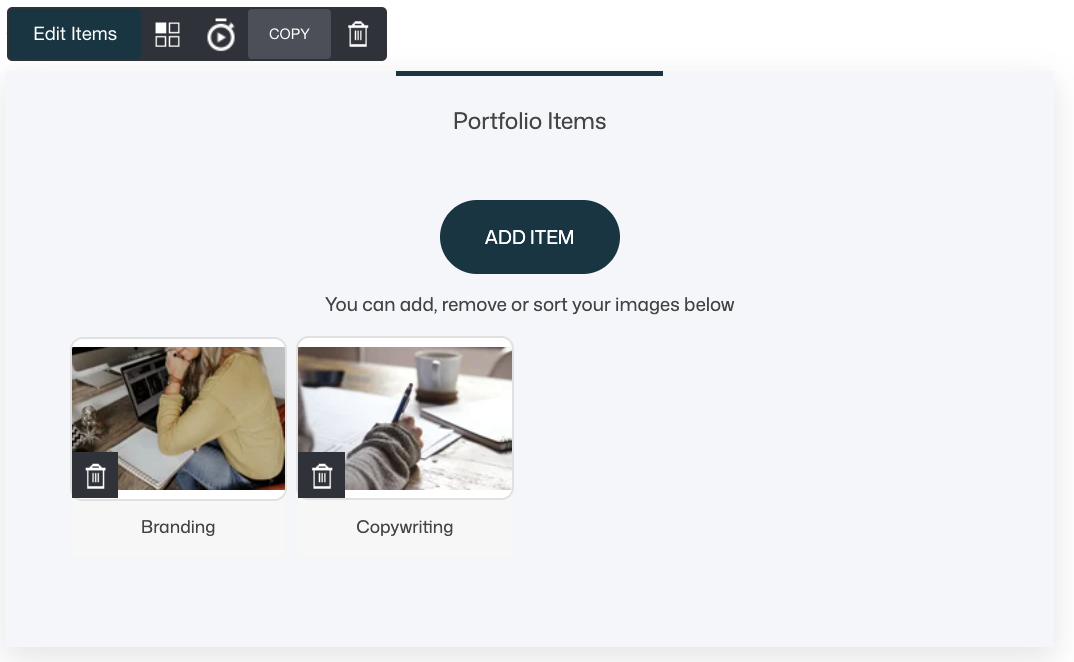
Each widget instance can display a curated selection of items.
Layout Options
The Portfolio widget offers two layout types: Grid and Carousel.
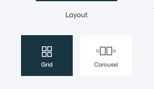
Both layouts share several core settings, while the Carousel layout adds a few additional, behavior-based options.
Below is a complete and clear overview of what can be configured for each layout.
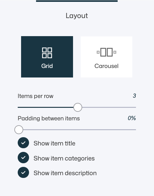
Grid Layout
In Grid layout, portfolio items are displayed in rows and columns, allowing visitors to browse multiple items at once.
Best suited for:
- Portfolio overview pages
- Browsing and comparison
- Large collections of work
- Structured, content-heavy sections
Available settings in Grid layout:
- Items per row Controls how many portfolio items are shown per row.
- Fewer items per row → larger visuals, stronger focus
- More items per row → denser layout, more items visible
- Padding between items Adjusts the spacing between portfolio items.
- Show item title: Displays the portfolio item’s name
- Show item categories: Helps visitors understand context or grouping
- Show item description: Adds explanatory or storytelling content
💡 Tip
Grid layout works best when users need to scan, compare, or explore multiple items at once. Use generous spacing and fewer items per row for a premium, gallery-like feel.
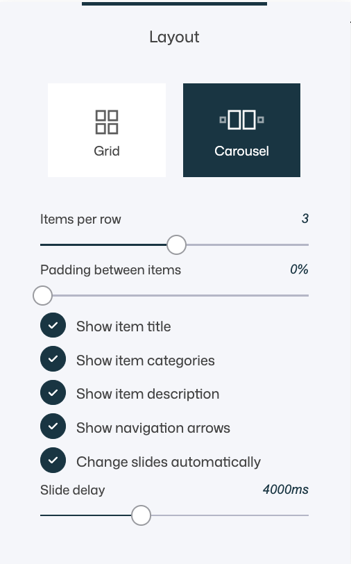
Carousel Layout — Complete Settings
In Carousel layout, portfolio items are displayed in a horizontal slider that visitors can scroll through.
Best suited for:
- Featured or highlighted work
- Limited-space sections
- Story-driven presentations
- Homepages and landing pages
Available settings in Carousel layout:
- Items per row Controls how many items are visible at once within the carousel.
- Padding between items Adjusts spacing between carousel items.
- Show item title: Displays the portfolio item’s name
- Show item categories: Helps visitors understand context or grouping
- Show item description: Adds explanatory or storytelling content
- Show navigation arrows Allows users to manually navigate between items.
- Change slides automatically Enables automatic slide rotation without user interaction.
- Slide delay Defines how long each slide is shown before moving to the next one (in milliseconds).
💡 Tip
Use automatic sliding sparingly. A delay of 3–5 seconds usually feels natural and gives users enough time to view each item without feeling rushed.
Choosing Between Grid and Carousel
- Choose Grid when visibility, structure, and comparison are important.
- Choose Carousel when focus, storytelling, or space efficiency matters.
- Both layouts can display the same content — the difference is how users experience and navigate it.
Always preview your chosen layout on both desktop and mobile, as spacing and interaction feel very different depending on screen size.
Design & UX Tips
- Keep the number of items manageable per section
- Use consistent image sizes across portfolio items
- Choose Grid for browsing and comparison
- Choose Carousel for storytelling and featured work
- Combine portfolios with headings to provide context
- Avoid mixing too many layouts on the same page
Common Scenarios and Best Practices
- Creative portfolio: Grid layout, fewer items per row, titles enabled
- Case studies: Grid layout with titles and descriptions enabled
- Homepage highlights: Carousel layout with auto-rotation
- Product inspiration: Grid layout with categories enabled
- Minimal visual gallery: Grid layout with titles only
Summary
The Portfolio widget allows you to:
- Display existing portfolio items visually
- Choose between grid and carousel layouts
- Control spacing, item count, and content visibility
- Highlight work, projects, or collections professionally
Used thoughtfully, the Portfolio widget helps you tell a visual story, build credibility, and guide visitors through your work in a structured and engaging way.