
How to use the Header Login / Profile Widget
The Login / Profile header widget provides a simple, built-in way to give members access to your site’s login and profile area directly from the header.
It is designed for websites with memberships, online courses, client portals, or community areas where users need to log in quickly and consistently.
This article explains how the widget works, its available options, limitations, and when you may want to use alternative solutions for more advanced login flows.
What the Login / Profile Header Widget Is
The Login / Profile widget is a header-specific widget that creates a direct link to the system Member Login / Registration page.
Key characteristics:
- Links to the platform’s system login / registration page
- Automatically adapts based on user state:
- Logged out → shows Login
- Logged in → links to Profile
- Designed for simplicity and consistency
- Requires no manual linking or logic
It is the fastest way to add member login access to your header.
When to Use the Login / Profile Widget
Use this widget when you:
- Have one primary login area for your site
- Want a simple, reliable login link in the header
- Prefer automatic behavior (login → profile when authenticated)
- Do not need multiple login destinations or custom flows
Typical use cases include:
- Online course platforms
- Membership portals
- Client dashboards
- Community-based websites
- Internal portals with a single login entry point
Placement Rules and Limitations
Important limitations to understand:
- You cannot add multiple Login / Profile widgets in the same header
- This applies regardless of:
- Which row (top, middle, bottom)
- Which column (left, center, right)
This ensures a clear and unambiguous login experience for visitors.
Login / Register Link Display Styles
The widget offers three display styles for how the login/profile link appears in the header.
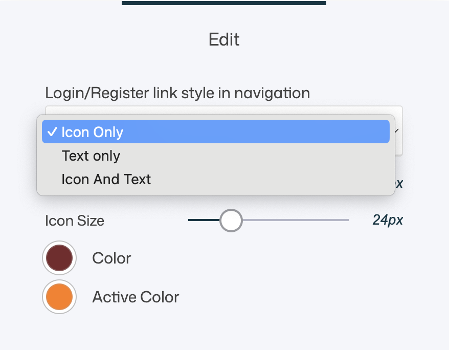
Icon Only
- Displays a user/profile icon
- No text label
- Clean and minimal
Best for:
- Compact headers
- Icon-based navigation
- Minimalist designs
Text Only
- Displays a text label (e.g. Login / Profile)
- No icon
Best for:
- Clarity-first designs
- Content-heavy or less technical audiences
- Headers where text navigation is preferred
Icon and Text
- Displays both icon and text together
Best for:
- Maximum clarity
- Mixed navigation styles
- Larger headers or desktop-focused layouts
Styling Limitations (Important)
The Login / Profile widget has intentional constraints:
- The icon cannot be changed
- The text label cannot be edited
- You can adjust:
- Size
- Icon size
- Color
- Active color
- Alignment (via header layout)
This ensures consistent behavior and language across the system.
How the Login Flow Works
- Clicking the Login / Profile widget always routes users to the system Member Login / Registration page
- This page is managed under Web Studio> Pages > System Pages > Member Login /Registration
- The login widget itself does not contain the form — it only links to it
Where to Customize the Login Experience
To customize the actual login and registration experience:
- Open System Pages
- Locate the Member Login / Registration page
- Adjust:
- Layout
- Styling
- Fields
- Registration behavior
- Redirects
This is where all form-level customization happens.
Recommended Alternative: Custom Login Buttons (Advanced Use)
If you need more control, the built-in Login / Profile widget may be too limited.
When to Use a Custom Button or Icon Instead
Consider using a regular Button or Icon widget in the header when you want to:
- Create multiple login flows (e.g. different member groups)
- Direct users to different login pages
- Fully customize:
- Text
- Icon
- Copy
- Styling
- Control onboarding, redirects, or registration logic
How This Works
- Create one or more custom pages
- Add a Member Login / Registration widget to each page
- Configure each widget differently:
- Group assignment
- Redirect behavior
- Default tab (login vs register)
- Link header buttons/icons to those pages
This gives you full design freedom and flow control.
Trade-Offs to Consider
Login / Profile header widget
✅ Simple
✅ Automatic login/profile switching
❌ Limited customization
❌ One per header
Custom button or icon
✅ Full design control
✅ Multiple login destinations
✅ Custom copy and icons
❌ Requires manual setup
❌ No automatic label switching (login/profile)
Both approaches are valid—it depends on your needs.
UX & Design Best Practices
- Use the built-in Login / Profile widget if you have:
- One login
- One audience
- One clear member area
- Use icon-only style in compact or sticky headers
- Use text or icon+text when clarity matters
- Place login access consistently (usually right-aligned)
- Keep login easy to find but not overly dominant
- If using custom buttons, clearly label intent (e.g. Member Login, Student Access)
Summary
The Login / Profile header widget allows you to:
- Add a quick login/profile entry point to your header
- Automatically adapt between login and profile states
- Choose between icon, text, or combined display styles
- Link directly to the system login/registration page
- Keep login access consistent and simple
Use it for straightforward membership setups.
For advanced flows, multiple logins, or fully custom design—use regular buttons or icons linked to dedicated login pages.
Both approaches can coexist strategically to create a clear, user-friendly authentication experience.