
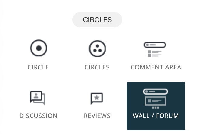
Wall / Forum Widget
The Wall (Forum) Widget lets you create rich, social content streams where members can publish posts, interact through comments and reactions, and engage in ongoing conversations across your site, funnels, and Circles.
Unlike Discussions – which are optimized for thread-based conversations—Walls focus on post-driven content, similar to a social feed or forum. Members create posts that can include richer content, followed by structured comments and reactions.
Walls are ideal for:
- Community feeds
- Announcements and updates
- Member-generated content
- Forum-style discussions
- Social interaction inside memberships
With the Wall / Forum Widget, members can:
- Create rich content posts
- Comment on posts
- React to posts and comments
- Participate in structured community conversations
- Engage across pages, funnels, and Circles
💡 Tip
Walls are reusable. The same wall (channel) can appear in multiple places while keeping all posts, comments, and reactions in sync.
Where You Can Use the Wall / Forum Widget
The Wall Widget can be added anywhere widgets are supported, including:
- Pages
- Blog posts
- Funnel steps
- Popups
- Inside Circles
This makes it easy to place social interaction exactly where it makes sense—inside communities, below lessons, in onboarding flows, or in dedicated forum areas.
How to Add a Wall / Forum Widget
To add a Wall Widget:
- Open the page, funnel step, popup, or Circle page you want to edit
- Click the ➕ (plus) button to open the widget panel
-
Locate the Wall / Forum Widget
- Drag it onto the canvas

Once added, you can configure how the wall behaves, looks, and who can interact with it.
Choosing the Wall Structure
When setting up the Wall Widget, the first and most important decision is how many walls (channels) you want—and how they should be displayed.
There are two main structures:
- Single Wall
- Multiple Walls (with different view styles)
Each option serves a different purpose and offers different configuration possibilities.
1. Single Wall
A Single Wall is best when you want one central feed of posts tied to a specific context.

When to Use Single Wall
Use a single wall when you want:
- One shared community feed
- A forum-style post stream
- Announcements or updates
- Simple social interaction without topic separation
Typical use cases:
- Community feed inside a Circle
- Updates under a program
- One central forum stream
Single Wall Settings
When Single Wall is selected, the following settings are available:
Wall (Channel) Settings
-
Wall name
Who can post:
- All Members
- Admins only
- Admins and Moderators
- Require approval on new posts (optional)
Post Display Settings
- Post layout:
- Full Post
- Compact View
- Post opens in popup on click:
- With sidebar comments
-
With comments below
Collapse comments by default (optional)
Reaction type:
- Let users choose
- Emoji reactions
- Upvote/downvote reactions
Comment Section Settings
-
Number of comments to display per post
Who can comment:
- All Members
- Admins only
- Admins and Moderators
- Require approval on new comments (optional)
Widget Settings
- Fixed height (optional)
- Use dark theme (optional)
💡 Important
The wall name is reusable. The same wall can be embedded in multiple pages, funnels, or Circles– and all posts and comments remain connected wherever it’s shown.
2. Multiple Walls
Multiple Walls allow you to create several parallel post feeds, each with its own purpose and settings.
This setup is ideal for:
- Different topics or categories
- Multiple community areas
- Structured forum spaces
- Larger communities
When using Multiple Walls, you:
- Define multiple walls (channels)
- Add, rename, delete, and reorder walls
- Choose how the walls are displayed using a View Style
There are three available view styles.
💡 Important
Wall names are reusable. The same wall can be embedded in multiple locations while keeping all posts and comments in sync.
2A. Multiple Walls – Row View
Row View displays walls in a vertical, stacked layout.

Opening a channel by clicking on it:

When to Use Row View
Row View is ideal for:
- Structured forums
- Topic-based browsing
- Educational or documentation-style layouts
Row View Characteristics
- Walls stacked one below the other
- Clean, linear layout
- Easy to scan and follow
Row View Settings
Widget-Level Settings:
- Fixed height (optional)
- Use dark theme (optional)
Wall Settings:
- Wall name
- Who can post
- All Members
- Admins only
- Admins and Moderators
- Require approval on new posts (optional)
Post Display Settings:
- Post layout
- Full Post
-
Compact View
Post opens in popup on click
- With sidebar comments
- With comments below
- Collapse comments by default (optional)
- Reaction type
- Let users choose
- Emoji reactions
- Upvote / downvote reactions
Comment Section Settings:
- Number of comments to display per post
- 3
- 5
- 10
- 20
- Who can comment
- All Members
- Admins only
- Admins and Moderators
- Require approval on new comments (optional)
Header Style (Available ✅)
- Group image
- Group description
- Group background color
💡 Note
Each wall can be visually customized to clarify its purpose, match your branding, and improve scannability.
2B. Multiple Walls – Column View
Column View displays walls as cards in a grid layout.

Opening a channel by clicking on it:
When to Use Column View
Column View works best for:
- Community hubs
- Forum overviews
- Program or topic libraries
Column View Characteristics
- Walls displayed in columns
- Choose 2–5 walls per row
- More visual and card-based than Row View
Column View Settings
View-Specific Settings
- Column split (2–5 columns per row)
Widget-Level Settings
- Fixed height (optional)
- Use dark theme (optional)
Wall Settings
- Wall name
- Who can post
- All Members
- Admins only
- Admins and Moderators
- Require approval on new posts (optional)
Post Display Settings
- Post layout
- Full Post
- Compact View
- Post opens in popup on click
- With sidebar comments
- With comments below
- Collapse comments by default (optional)
- Reaction type
- Let users choose
- Emoji reactions
- Upvote / downvote reactions
Comment Section Settings
- Number of comments to display per post
- 3
- 5
- 10
- 20
- Who can comment
- All Members
- Admins only
- Admins and Moderators
- Require approval on new comments (optional)
Header Style (Available ✅)
- Group image
- Group description
- Group background color
💡 Note
Column View is ideal when you want a branded, library-style forum layout with clear visual separation between walls.
2C. Multiple Walls – Sidebar View
Sidebar View presents walls in a chat-like interface.

When to Use Sidebar View
Sidebar View is ideal for:
- Communities
- Support environments
- Ongoing conversations
Sidebar View Characteristics
- Wall list displayed on the left
- Active wall shown in the main area
- Highly interactive, social experience
Sidebar View Settings & Limitations
View-Specific Settings:
- Discussion Board Name
Widget-Level Settings:
- Fixed height (optional)
- Use dark theme (optional)
Wall Settings:
- Wall name
- Who can post
- All Members
- Admins only
- Admins and Moderators
- Require approval on new posts (optional)
Post Display Settings:
- Post layout
- Full Post
- Compact View
- Post opens in popup on click
- With sidebar comments
- With comments below
- Collapse comments by default (optional)
- Reaction type
- Let users choose
- Emoji reactions
- Upvote / downvote reactions
Comment Section Settings:
- Number of comments to display per post
- 3
- 5
- 10
- 20
- Who can comment
- All Members
- Admins only
- Admins and Moderators
- Require approval on new comments (optional)
Styling Limitations (Important ❌)
Sidebar View does not support:
- Header images
- Group descriptions
- Background colors
💡 Important
Sidebar View prioritizes speed, readability, and interaction flow over visual branding.
Wall Settings (Applies to All Views)
Each wall has its own core settings:
- Wall name
- Who can post:
- All Members
- Admins only
- Admins & Moderators
- Post approvals (optional)
- Comment approvals (optional)
Post & Comment Behavior
- Posts support rich content
- Comments are structured under each post
- Reactions can be enabled per post and comment
💡 Important note – Member Registration Required for Social Interaction
To comment, react, or participate in any social features inside Recrevio, users must be registered and logged in as members.
This applies to all social and community-based widgets and areas, including:
- Comments
- Discussions
- Walls /Forums
- Reviews
Only logged-in members can:
- Write comments or replies
- React to content (likes, emojis, etc.)
- Mention other members
- Participate in discussions or threads
Visitors who are not logged in can view content (if access levels allow it), but they cannot interact until they have created a member account and logged in.
💡 Why this matters
Requiring member registration ensures:
- Clear identity and accountability in discussions
- Better moderation and role-based permissions
- Accurate engagement tracking and notifications
- A safer, more structured community experience
If interaction is an important part of your experience (comments, discussions, community), make sure:
- Member registration is enabled
- Access levels allow logged-in members to view the content
This creates a smooth and secure foundation for meaningful engagement inside your Circles and social areas.
Managing Walls (Multiple Walls Only)
When using Multiple Walls, you can:
- Add new walls
- Rename existing walls
- Delete walls
- Drag & reorder walls freely
This allows you to:
- Highlight important feeds
- Keep active walls visible
- Adapt structure as your community grows
Creating Posts on a Wall
The Wall is designed for rich, flexible posts where members can share updates, questions, reflections, images, and polls in a more expressive format than standard discussions.
Creating a post is simple and intuitive, and gives members multiple options for formatting and interaction.
How to Create a Wall Post
To create a new post on a Wall:
- Navigate to the Wall where you want to post.
- Click Create Post (or the input field at the top of the wall).
- A post composer opens, where you can write and customize your post before publishing.
Writing Your Post
In the post editor, you can:
- Write a title
- Write text using the rich text editor
- Format your content with:
- Bold, italic, underline, and strikethrough
- Headings and normal text
- Links and inline code
- Use emojis to add tone and personality

The editor is designed to support both short updates and longer, more detailed posts.
Adding Rich Content
You can enhance your post with additional content:
-
Images
Upload one or more images to visually support your message.
-
Polls
Add a poll directly inside the post to ask questions, gather opinions, or involve the community in decisions.
These elements appear inline with the post and become part of the conversation.
Choosing Post Layout (post with images only
Before publishing a post with images, you can choose how your post is displayed:
-
Full Post
Displays the post with full content and visuals visible directly in the wall feed.
-
Compact View
Shows a more condensed version of the post, keeping the wall cleaner and easier to scan.

The selected layout affects how posts appear for all members viewing the wall.
Post Reactions
You can also define how members can react to the post:
- Emoji reactions – Members can react using emojis (e.g. ❤️ 👍 🎉).
- Upvote / Downvote – Members can vote posts up or down.
- Let users choose – Allows multiple reaction types depending on wall settings.

Reactions make it easy for members to engage even when they don’t want to comment.
Publishing the Post
When your post is ready:
- Review the content, layout, and reaction options.
- Click Publish.
Your post is immediately added to the wall (or sent for approval, if post approval is enabled).
After Publishing
Once published, members can:
- React to the post
- Comment and reply (based on wall permissions)
- Engage in threaded conversations under the post
- Participate in polls included in the post
Posts can be edited or moderated later depending on your role and wall settings.
💡 Tip
Walls work best when you encourage informal, human posts. Short updates, questions, images, and polls help create a living, engaging community space—not just announcements.
Summary
The Wall / Forum Widget allows you to:
- Create post-based community feeds
- Support single or multiple walls
- Enable rich posts, comments, and reactions
- Control permissions and moderation
- Choose between structured, visual, or chat-style layouts
Key Takeaway
- Single Wall → one central social feed
- Multiple Walls
- Row View → structured & stylable
- Column View → visual & stylable
- Sidebar View → chat-like, no styling
By choosing the right structure and view style, you can build engaging, scalable, and social forum spaces exactly where your members need them.