
How to Use the Header Menu Widget
The Header Menu widget is used to build primary navigation inside your site header.
It is largely identical to the standard Menu widget in terms of structure, layout options, and styling — with one powerful addition: Mega Menus.
Used well, the Header Menu widget creates clear, scalable navigation that works across desktop and mobile while supporting complex site structures.
What the Header Menu Widget Is Used For
Use the Header Menu widget to:
- Build your main site navigation
- Organize pages and content hierarchically
- Create dropdown submenus
- Create advanced Mega Menus for large content structures
- Support both simple and complex navigation needs
Common use cases:
- Main navigation for websites
- Navigation for large content libraries
- Ecommerce category navigation
- Membership or portal navigation
- Campaign- or product-focused navigation
📌 Note
Only one primary navigation menu is typically needed in a header, but it can contain multiple levels of structure using submenus or Mega Menus.
Adding and Managing Menu Items
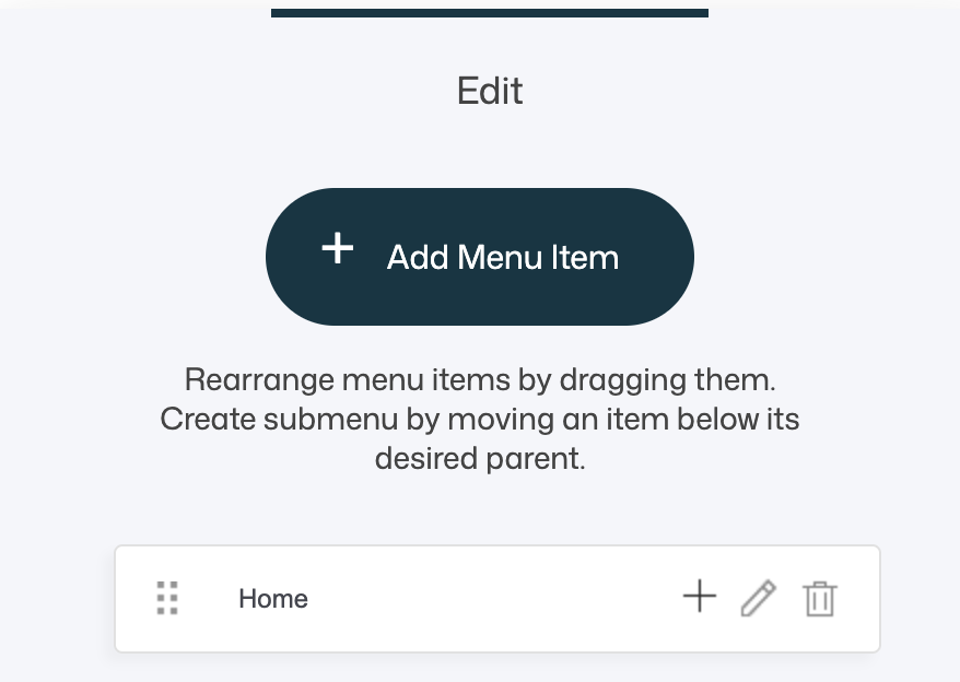
Add Menu Item
Click Add Menu Item to create a new navigation entry.

When you add or edit a menu item, the Select a Link popup opens. This is the same link selector used throughout the platform, meaning you can link to almost anything:
- Pages
- Store items
- Funnels
- External URLs
- Anchor points
- Files
- Popups
- Video popups
- Email links
- Phone links
💡 Tip
The Header Menu widget uses the same link system as buttons and text links, giving you full flexibility in what each menu item points to. For a full explanation of all link types and options, see the separate article: How to Use Links
Creating Submenus (Dropdowns)
You can create one level of traditional submenus using drag-and-drop.

How it works
- Use the drag handle on the left side of a menu item
- Drag the item slightly to the right and place it under another menu item
- The item becomes a submenu of the parent item
This allows you to:
- Group related pages under a main category
- Keep top-level navigation clean
- Reduce clutter in larger menus
💡 Best practice
Use submenus to group related content logically, but avoid deep nesting to keep navigation easy to scan and understand.
Mega Menu (Header-Only Feature)
The key difference between the Header Menu widget and the regular Menu widget is the ability to create Mega Menus.

What Is a Mega Menu?
A Mega Menu is an expanded dropdown panel that can contain:
- Multiple columns
- Headings and text
- Images
- Buttons
- Icons
- Any standard content widgets
- Multiple content blocks
Instead of a simple list of links, a Mega Menu acts like a mini layout or section inside your navigation.
Mega Menus are ideal when you need to present a lot of options without overwhelming users.
Creating a Mega Menu
Step-by-step
- Select a menu item in the Header Menu widget
-
Click the + (plus) icon to create a Mega Menu as a submenu for that item
-
Once created, click the Edit (pencil) icon on the Mega Menu
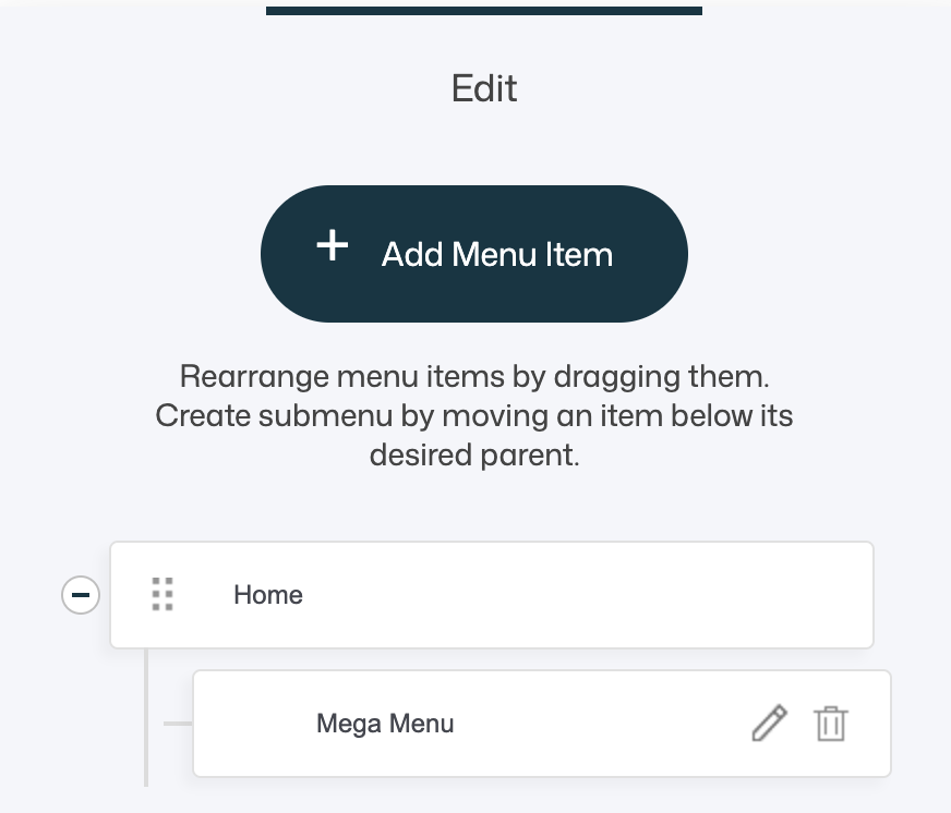


That’s it — the Mega Menu opens in the Web Studio editor.
Editing a Mega Menu
A Mega Menu is edited just like any other part of a page.
Inside the Mega Menu, you can for example:
- Add one or multiple blocks
- Define the number of columns
- Adjust column widths
- Add standard widgets (Text, Image, Button, Icon, Menu, etc.)
- Add backgrounds, spacing, and separators
- Create structured layouts with headings and grouped links
There are no special restrictions — it behaves like a normal layout area.
Common Mega Menu Structures
- Multi-column link lists (e.g. Services, Products, Resources)
- Category columns with headings
- Image + text combinations
- Promotional blocks with CTAs
- Featured content or campaigns
💡 Design tip
Keep Mega Menus visually structured:
- Use headings for clarity
- Limit the number of columns
- Avoid overly dense content
- Maintain strong contrast and spacing
When to Use a Mega Menu
Mega Menus work best when:
- You have many top-level sections
- Each section contains multiple related pages
- You want to expose content without forcing deep navigation
- You want to guide users visually
Typical use cases:
- Large service catalogs
- Ecommerce category navigation
- Learning platforms or knowledge bases
- Membership portals
- Corporate or agency websites
💡 Best practice
If a simple dropdown works, use it. Mega Menus are powerful, but clarity should always come before complexity.
Menu Styling
The Header Menu widget includes the same styling options as the standard Menu widget, allowing full visual control.

Layout Types
-
Horizontal Menu – menu items in a row
Best for main navigation with fewer items.
-
Vertical Menu – menu items stacked
Less common in headers, but useful in vertical header layouts.
-
Burger Menu – menu hidden behind an icon
Common for mobile headers or compact designs.
Styling Options Overview

Colors
- Text Color
- Background Color
- Border Color (if borders are enabled)
Use brand colors and sufficient contrast for accessibility.
Menu Style (Borders)
- No border
- Wrap border around each item
- Border below each item
Choose based on clarity and visual density.
Text Alignment
- Left
- Center
- Right
Left alignment is generally best for readability.
Typography & Spacing
- Font family
- Font size
- Menu item spacing
- Uppercase toggle
💡 Tip
Match menu typography with buttons and headings for a cohesive UI.
Hover & Active Item Colors

You can define separate colors for:
- Hover state
- Active (current page) state
These states help users understand where they are and what’s clickable.
Submenu Styling

Submenus can be styled independently:
- Background color
- Text color
- Hover text color
- Optional shadow
- Optional border (with adjustable size and color)
Submenu Position
- Popup, next to the menu item – classic dropdown behavior
- Inline, below the menu item – expands within the menu flow
💡 Tip
Popup submenus work best for horizontal menus. Inline submenus work best for vertical or sidebar-style layouts.
Design & UX Tips
- Keep top-level navigation concise
- Group related content logically
- Use Mega Menus only when structure demands it
- Avoid too many columns or visual elements
- Test navigation on both desktop and mobile
- Ensure hover and active states are clearly visible
Summary
The Header Menu widget allows you to:
- Build flexible, structured header navigation
- Link to any destination supported by the platform
- Create submenus using drag-and-drop
- Build advanced Mega Menus with full layout control
- Choose between horizontal, vertical, and burger layouts
- Fully style text, spacing, borders, hover states, and submenus
Used thoughtfully, the Header Menu widget becomes the backbone of your site’s navigation — helping visitors find content quickly while supporting growth and complexity without sacrificing clarity.